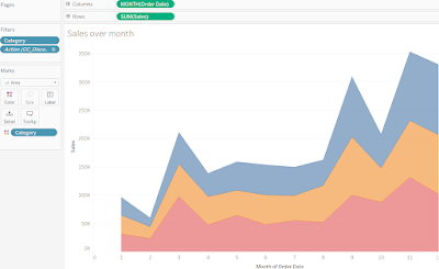
An area chart in Tableau is a visual representation of data where the area below the line is filled, emphasizing the magnitude and trend of values over time or any other dimension. It is particularly useful for showing the cumulative effect of multiple measures or comparing the distribution of values across different categories. Here's a step-by-step guide on how to create a discrete area chart in Tableau with an example.
Step 1: Prepare your data
Ensure that your data is structured appropriately. It should include a dimension field (e.g., date, category) and one or more measure fields (e.g., sales, profit) to represent the values to be visualized.
Step 2: Connect to your data source
Launch Tableau and connect to the data source containing your dataset. This can be an Excel file, a database, or any other supported data source.
Step 3: Create a new worksheet
In Tableau, navigate to the worksheet tab and create a new worksheet. This will serve as the canvas for building your area chart.
Step 4: Drag and drop the necessary fields
From the data pane, drag the dimension field (e.g., date, category) to the Columns shelf. Then, drag the measure field(s) (e.g., sales, profit) to the Rows shelf. Tableau will automatically aggregate the measures based on the default aggregation type (e.g., sum).
Step 5: Change the chart type
By default, Tableau may display the data as a bar chart or another chart type. To create an area chart, click on the "Show Me" panel on the top-right corner of the Tableau window. In the "Show Me" panel, select the area chart type.
Step 6: Customize the area chart
Tableau will generate the area chart based on your selected fields. However, you can further customize it to enhance readability and provide more insights:
6.1. Adjust the axis: Right-click on each axis and select "Edit Axis" to modify the range, tick marks, and other formatting options.
6.2. Format the area: Click on the "Color" or "Size" options in the Marks card to modify the appearance of the area. You can choose different colors, gradients, or transparency levels.
6.3. Add additional elements: Consider enhancing the area chart with additional elements such as reference lines, annotations, or other relevant data.
Step 7: Save and share
Once you are satisfied with the area chart, save the workbook and share it with others. You can export the chart as an image or publish it to Tableau Server or Tableau Public for wider distribution.
For example, let's say you have a dataset with sales data for different months. The sales figures for each month are as follows:
January: 100 units
February: 150 units
March: 200 units
April: 180 units
May: 250 units
By following the steps mentioned above, you can create a discrete area chart in Tableau that visually represents the sales trend over time. The x-axis will represent the months, and the y-axis will represent the sales units. The area below the line connecting the data points will be filled to emphasize the cumulative sales. You can adjust the axis formatting, customize the area appearance, and add annotations to provide more context.
The resulting area chart will allow you to analyze the sales trend, identify seasonal patterns, and compare the distribution of sales across different months or categories.
Thanks for Reading, Subscribe us for more latest Visualization From scratch.

No comments:
Post a Comment
If you have any doubts. Please let me know